UX Made EZ: An Agile Approach to Testing a Digital Collection
Kathryn Gucer provides a case study describing her experience in designing and conducting usability testing of a subject-based digital collection at the National Agricultural Library: the Animal Welfare Act History Digital Collection. While information professionals in libraries increasingly express a need for conducting flexible, low-cost, in-house usability testing on their digital collections, little literature exists addressing this need. This article speaks directly to readers among these groups and offers them a model for developing their own user tests based on Steve Krug’s Rocket Surgery Made Easy and, more broadly, on Agile methodology.
INTRODUCTION
In March 2018, after more than two years of development, the creators of the Animal Welfare Act History Digital Collection (AWAHDC, awahistory.nal.usda.gov ) were poised to launch this unique new digital library. We had encountered and solved many problems with the workflows (as described in Gucer et al. 2019) throughout the process of designing and implementing this collection in house at the National Agricultural Library (NAL, nal.usda.gov). These backend problems had delayed the completion of our user interface until the last stages of the project, but in the late spring of 2018 were finally ready to go live with this interface—almost. There was one thing left to do: conduct user testing. From the beginning of the project, we had envisioned testing the usability of our interface before launching the collection. But this was new territory for our development team and for the library in general. Although NAL had created and launched digital collections in the past, it had not conducted user testing on these products. We had no in-house model or policy to follow and our time was limited to a few months. Nor did we have funds in our budget to hire a usability professional. So, when a colleague casually mentioned Rocket Surgery Made Easy: The Do-It-Yourself Guide to Finding and Fixing Usability Problems by Steve Krug (Krug 2009), our ears perked up.
As the title suggests, Krug’s slim volume offers website creators a flexible, low-cost, low-stress, time-limited method for conducting user testing of websites. What is more, Krug’s approach to user testing is based in Agile methodology, an approach originally developed in the software industry. We on the AWAHDC team had already had success in incorporating elements of the Agile approach into the development of this digital collection, so Krug’s book was all the more appealing for this reason. Krug’s method was attractive for two further reasons. First, it assumes that amateurs can do user testing that is effective and will make their websites better. While Krug recommends hiring usability experts if funds are available, he says that the lack of such resources should not prevent amateurs from running their own tests. Secondly, we found that our production team perfectly fit the creators Krug describes as benefitting most from his method for user testing: “This book assumes that usability testing is not your life’s work and is probably not even part of your official job description.” The point is to get website creators to do some testing because so many do not (Krug 2009, p. 5).
In the following case study, I describe how we adapted Krug’s method to test the AWAHDC, how we implemented our protocol, and then reflect on our experience. Our perspective will be of interest to librarians and other information professionals in libraries or other nonprofit contexts. Although Krug pitches the book at all website creators, there is an emphasis in his examples and online materials on the websites of small- to medium-sized companies who sell and ship products to the public. Our experience shows how Krug’s method can be adapted to a non-profit, library context where “users” are researchers and students, and the “product” is public or otherwise available information that has been brought together and curated in a digital resource with specialized instructions, search, and faceting functions. We sense that there is a need among these professionals for practical, how-to information on usability testing. A cursory search of the LIS literature suggests that little has been written on the user testing of small subject-oriented collections, much less agile methods in such user testing. What is more, whenever we have promoted the AWAHDC among librarians and information professionals at other libraries, they have been very keen to learn about our agile method and have lamented the lack of user testing of similar products in their organizations. This article speaks directly to readers among these groups and offers them a model for developing their own user tests.
This article is not a replacement for Krug’s book. Readers interested in conducting usability testing on the model presented here should obtain and read Rocket Surgery Made Easy. Krug offers many instructions, details about, and options within, his method of user testing that we do not cover. In fact, the method that we fashioned from Krug’s book is a slimmer version of his already sleek model. At times we point to these differences but we do not cover them in detail or comprehensively. This case study shows how we used Krug’s method in our library and presents some highlights from our results as a way of whetting librarians’ appetite for usability testing and convincing them that it can be done. The article also reveals the significant payoff that libraries will get from testing their digital products for relatively little cost and effort.
BACKGROUND
This section describes the AWAHDC briefly and then summarizes how our usability tests fit into the digital production process at NAL. It thereby situates this method in the context of digital curation in a library. The AWAHDC is a free, full-text, and fully searchable, collection of US government publications in PDF documenting the legislative and regulatory history of the Animal Welfare Act, which was signed into law by President Lyndon Johnson in 1966. It was designed by the author of this article, a postdoctoral fellow in digital curation at the University of Maryland, and the director of the Animal Welfare Information Center (AWIC), which sponsors the AWAHDC and is based at the library. The AWAHDC is a key tool in fulfilling an important mission of the center to inform the members of the community regulated by the Animal Welfare Act, including research scientists and breeders, as well as the general public, about the intent and history of the act. Together, the director and I organized a team of librarians, cataloguers, web developers, and programmers at the library and oversaw the production of the collection from 2015 through to 2018. The user testing we describe here took place at the end of this this process, beginning in March 2018, once we had produced a working beta version of the collection’s interface (Figure 2), which is built in the open source content management system, Drupal (drupal.org).
At the outset, we imagined that our collection would contain 900 publications, but we quickly decided to scale back that number to 200. For various reasons that are outside the scope of this article, we realized that we would need to streamline the collection in order to push it through the digitization pipeline at the library in stages rather than all at once. This turned out to be a good decision in several ways. For one thing, it led us to investigate Agile methodology (Beck et al. (n.d.)) and incorporate its principles—which emphasize a “lean” mentality, responsive teamwork, and a flexible iterative approach to project management—into our production plan. The first round of production resulted in a beta version that we soft-launched in August 2018 and that was the result of the user testing that we describe below. As this schedule suggests, and as Krug points out (Krug 2009, pp. 30-37), organizations do not have to wait for a fully finished, or even largely finished, product to begin user testing. We began testing the AWADHC, when the frontend user-facing interface was basically usable and we felt that we it could benefit from usability testing. In this way, we folded usability testing into the digital production process at its last stage.
TEST DESIGN
Our testing protocol consisted of three rounds conducted with nine participants at one-month intervals across three consecutive months, as described by Krug (Krug 2009, pp. 22-29). In each round, three participants took the same test one after another in one morning, with 15-minute intervals between each session. Each session lasted no more than one hour. The sessions were conducted one-on-one with the participant and the author, and with one silent observer (AWIC’s director).
I was seated slightly to the side and behind the participant so that I could view the screen. The silent observer was seated well behind the participant and the author. She had her own monitor, on which she observed the participant’s screen using screen-sharing software (we used Webex but Skype is also an option), and a notebook in which she kept notes. These interviews were recorded using screen and audio capture software–in our case Camtasia (techsmith.com/video-editor.html).
After all interviews in each round were complete, the director and I discussed what we had learned from these interactions, what were the most significant problems, and how to go about fixing them before the next round of user testing. From beginning to end, each round took between five and six hours. The sessions were highly structured. I read from a script from the beginning to the end of each session, encouraging the participant to vocalize their experience and, when necessary, keeping them on task. A sample test script is provided in Krug’s book and we largely adopted it. While reading out loud can feel artificial, this protocol ensures that the test will be uniformly conducted and that all questions and issues will be covered.
The core of the test was four tasks that the participant was to perform using the AWAHDC, without any help from external websites (see an example in Figure 1) or from us. After a participant received a task, we asked them to talk through their process of performing the task as they completed it. This verbal description of their experience was, by far, the most important aspect of the test, not whether a participant completed the task successfully. As Krug repeatedly points out, the participant’s immediate and authentic experience of the website provides the most revealing and useful information for its designers. Of course, it feels good for all when a participant completes a task. But the point of user testing is to find and fix problems with the site. So the more the participant talks through their moment-to-moment exploration of and reactions to the site, the more information the designers gain. Failure or partial success, if it involves a lot of interaction and feedback is far more informative than easy, immediate success. As the above description suggests, the goal of each round is to identify basic problems with the site so that we could fix them before the next round of testing. “Working software,” as the Agile Manifesto puts it, “is the primary measure of progress” (Beck et al.), not a perfect or even completely finished product.
RESULTS
In this section I highlight two results of our usability test that illuminate its impact on our collection. Drawing these highlights from rounds one and three, I focus on a major payoff from each round that significantly improved the AWAHDC.
Round One
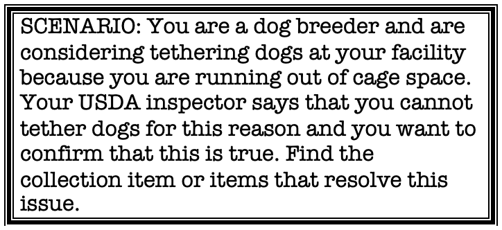
The first round of usability testing had the biggest impact on the AWAHDC because all three of our participants had the same immediate response to the homepage: they were confused about the website’s identity and purpose. This confusion arose at the very beginning of the session, before we even got to the four main tasks. We asked the participants to look at the homepage and, without clicking on anything, describe what they saw. In response, all three expressed the same confusion arising from an unintended contradiction on this page. Specifically, the words identifying the site — that is, “The Animal Welfare Act History Digital Collection” — were in the largest font on the page and were located in the right section of a horizontal banner across the upper part of the screen, where the Google-type search bar was also located. But the majority of the page was taken up by an interactive timeline that drew users’ attention to a large colorful image of animals in the center of the page and an accompanying description of the timeline’s function. The timeline prompted users to click on white arrows to the right of the screen that led them through a series of ten panels, with engaging images and information on the act.
The participants in this first round were all so drawn to this timeline that they did not explore the rest of the page. Or, when they did, they expressed confusion about the site. “Is this website a timeline, an exhibit, or is it a digital library?” was a common response. This confusion carried over into the rest of the session, as participants repeatedly returned to the timeline looking for answers it could not provide. There was, we realized, an unintended mixed message embedded in the homepage that could prevent our users from understanding what the AWAHDC was, what it was for, and from discovering its full functionality
Payoff: Usability Testing Reveals What’s Hidden in Plain Sight
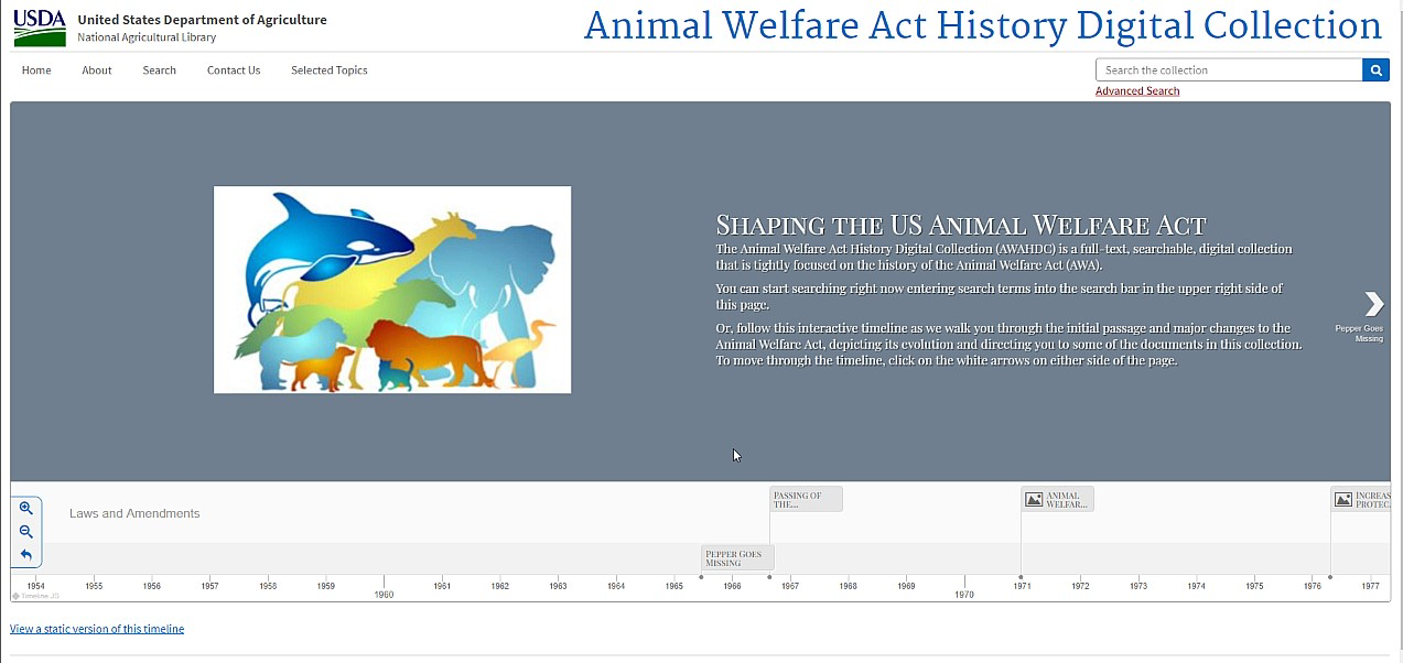
User testing allows website creators to see aspects of their site to which they have become blind. To our participants the mixed message in the design of the homepage was as plain as day, but after months of rethinking and tweaking the site, we had become inured to its most obvious flaw. Early on we had discussed the possibility that the timeline would draw users away from the site’s main functionality: the search, retrieval, and organization of documents in the collection. But we had balanced this concern against a desire to inform general users up front about the act and its history in a visually engaging form. This first round of testing brought us back to our senses and told us to keep it simple. In the month before the next round of user testing, we worked with the web developer on our team to redesign the home page so that it emphasized the site’s main purpose and functionality. The revised homepage (Figure 3) removed the timeline from the homepage to another page. The search bar was now squarely in the center of the page next to the image of the animals. Underneath the search bar we added a call to action, alerting users to the timeline for general users: “Not sure where to start? Take a look at our Interactive Timeline!”
Round Three
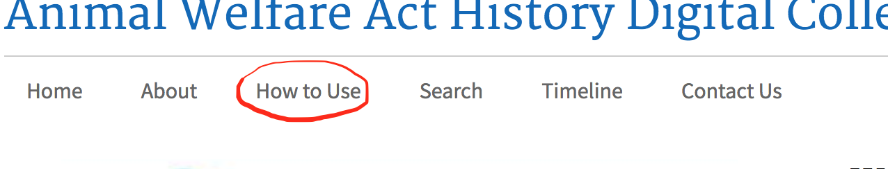
Round Three in our user testing illuminated the solution to a problem we had become aware of throughout the first two rounds of testing but for which we had no single clear solution. Specifically, in order to use the AWAHDC effectively, users need to have a basic understanding of the two processes by which US laws are enacted in United States Congress and subsequently enforced in the executive agencies: the legislative and regulatory processes respectively. We therefore created an infographic informing readers about these processes and how they relate to the documents in the AWAHDC. This infographic appears on the “How to Use” page on our site. Users can access the page using the “How to Use” link in the main menu on the homepage (Figure 4):
Our problem was how to ensure that our users clicked on this link and encountered this infographic in time for it to guide their searches. Without this information, their experience of the site would be diminished and they might not understand the AWAHDC’s full significance and utility. They might even leave the site frustrated and disinclined to return. We therefore designed one of our tasks so that participants would, we hoped, encounter this page and use its information in the retrieval of a specific piece of information. In practice, however, the paths our participants took in solving this task did not take them to this “How to Use” link or the related page. The result was that, if they found the piece of information required by the task (i.e., the title of a government serial, Congressional Record), they used other routes to get there.
Payoff: Usability Testing Reveals Solutions, Not Just Problems
Ironically, these repeated failures eventually offered us a solution to our problem. As our participants increasingly found their way to the “Congressional Record” by way of alternate paths than the one we had imagined, it dawned on us that we could create multiple routes to the page we wanted them to find and accentuate those paths. This realization resulted in some very simple changes to the existing site, including adding a link to the words “legislative and regulatory documents” in the description of the collection at the center of the homepage. We knew from earlier rounds of testing that this text’s central position next to the eye-catching image of the animals on the home page immediately drew users’ attention in ways that the “How To Use” link in the menu bar did not. This experience illuminated a wiser, more flexible perspective on the elements (e.g., text, images, white space, organizational features) within our site—that is, as potential pathways within a virtual space whose constituent parts were separate but nonetheless interconnected and navigable. In this and other ways, conducting our own usability testing increased our expertise in our own site, and in the development of good sites more broadly.
CONCLUSION
Given the enormous advantage of conducting usability testing, it is surprising how little of it gets done in libraries that sponsor digital collections. This situation may be based in the belief that such testing has to be a ‘big deal’ - expensive, labor-intensive, and time-consuming - and that it will distract from the development process. Our experience shows that such a belief is mistaken. Indeed it also shows that Krug’s low-cost, flexible method of DIY usability testing can prevent huge expenditures of time and money by incorporating the learning gleaned from these tests into the development process. In our model, there is no distinction between the usability expert and development team, which prevents problems from taking root and becoming larger and more intractable down the road. “The funny thing about usability testing,” Krug says, “is it just works” (Krug 2009, p. 15). This has certainly been our experience.
The author would like to thank Rachel Donahue for her invaluable suggestion of Krug’s book.
REFERENCES
Beck, K. et al. (n.d.). Manifesto for agile software development. Retrieved from http://agilemanifesto.org
Gucer, K., Adams, K., Schoppet, C., Punzalan, R. (2019). Getting to Beta: Building a Model Collection in a World of Digital One-Offs. International Journal of Digital Curation, 13(1), 271-285. doi.org/10.2218/ijdc.v13i1.554
Krug, Steve. (2009). Rocket Surgery Made Easy: the Do-It-Yourself Guide To Finding and Fixing Usability Problems. New Riders, San Francisco, CA.
Animal Welfare Information Center, USDA. (2019). Animal Welfare Act History Digital Collection. Retrieved from http://awahistory.nal.usda.gov